Oracle cards for divination and games -- shipping now!
Latest Updates from Our Project:
Hugos, calligraphy, and a new project!
4 months ago
– Tue, Mar 10, 2026 at 04:16:03 PM
Hello, all! I'm sending a quick update because there are a handful of things you should know about . . .
HUGO AWARDS
If you registered for the LA WorldCon before the end of January, you're eligible to nominate for the Hugos. And there are several different ways in which this project is eligible for nomination!
Where the art categories are concerned, the eligibility rules are . . . well, quite frankly, they're a mess. (I attended the online WSFS business meetings last year as part of my participation in the Speculative Poetry Initiative, and watched Yet Another Attempt to reform the art categories get shot down. Everyone agrees the rules no longer match the reality of the SF/F art world, but no one can agree on how to fix them.) I've been in touch with the Hugo administrators, though, and while they officially won't make eligibility rulings ahead of time -- to avoid having to rule on a thousand things that wind up not making the ballot -- my best guess, based on that conversation, is that Avery Liell-Kok and A.C. Esguerra are eligible in the category of Best Professional Artist, and Emiko Ogasawara is eligible in the category of Best Fan Artist. if you want to cover your bases for sure, and you have the nomination slots available, you can nominate all three of them in both categories!
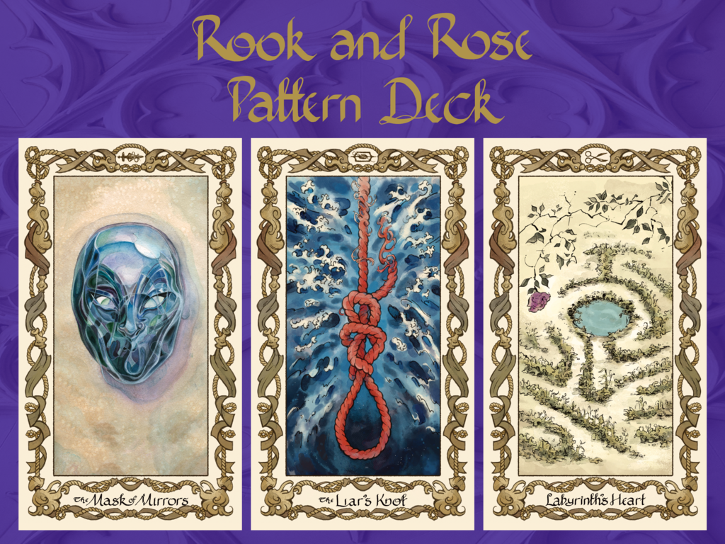
In addition to that, the Rook and Rose pattern deck itself is eligible in the category of Best Related Work. This is the catch-all category meant to give the SF/F world a way to recognize things that don't fit tidily into the other categories.
We're grateful to anyone who is willing and able to recognize the work of our artists in this fashion! They've made something so beautiful for us; we'd love to see it honored on a larger stage.
And speaking of Avery's art . . .
NEW PROJECT!
You may have already gotten, or will get at some point in the near future, a notification from Kickstarter that I'm doing another project. An idle conversation with a friend made me realize it was entirely feasible for me to create an adult coloring book based on my solo series, the Memoirs of Lady Trent -- and furthermore, that I could use this as an opportunity to share some snippets of Isabella's scientific writings on dragons, which readers have been asking about for years!
So I'm teaming up again with Avery to create Lady Trent's Field Journal: A Dragon Coloring Book! This will be available in a variety of formats, from files you can print at home or color in digitally, to loose-leaf sheets suitable for framing, to a paperback book, to a special signed edition with a bonus lil' sketch from Avery. I'm also offering bookplates and signed paperbacks of the series as add-ons. The campaign will launch next month, and if you click on that link above, you can sign up to be notified when it goes live! (Being a pre-launch follower helps in general, as it boosts the project's visibility on Kickstarter.)
And finally . . .
ROOK AND ROSE FONT!
In a previous update, I mentioned a secret additional thing I was working on. It's not complete yet, but it's close enough to being done that I can announce: I'm working on turning the calligraphy style I created for the cards into a computer font!
I hope to have it finished soon, but this is very much a case where the question is, how deep down the rabbit hole am I willing to go? I'm not a professional font designer by any means, so the service I'm using to create it is Calligraphr. That does allow for ligatures (one or more characters joined together when typed adjacently) and variant character forms (if I put them in e.g. as Greek letter), thereby allowing me to include the characteristic features of the pattern deck lettering style. But, well, there are a lot of potential ligatures. Like, in the hundreds -- especially since, say, an "at" ligature is one instance, "tt" is another, and "te" is a third . . . but "att," "tte," and "atte" are also separate ligatures. To pick just one example that in fact shows up in the word "pattern," as written on your decks and guidebooks. And there are approximately a dozen different capital S variants across the cards, not all of which I can fit in; I'll have to make a judgment call as to how many to include, and which ones.
So I can't say for sure when this will be done because it depends on when I decide I've lost my mind sufficiently and should just call it finished. But I hope to have it up on BackerKit within the next month or two!
--Marie
. . . are we done?
9 months ago
– Mon, Oct 06, 2025 at 02:17:10 PM
Current state of fulfillment . . .
. . . well, that's an interesting question now. The answer is either 96% done or 100%* done!
The lower number reflects the fact that there are a scattering of orders that can't currently be fulfilled, because they've run into a snag somewhere along the line: the survey is incomplete and I therefore don't have a mailing address, or the payment information is incomplete or errored out, etc. I've reached out to those backers individually, and a few of you have responded; for the rest of you, if you haven't yet gotten a notification that your shipment is mailed, please do check and make sure your order isn't hung up somewhere in the system!
The asterisk on the higher number is there for three reasons. One is that there are some orders marked as fulfilled in BackerKit that aren't actually, because it's easier for us to handle a few specialty rewards (like the remaining frock coat orders) individually rather than try to run them through BackerKit's system. If you're one of those people, you should have heard from me or Alyc already; if not, please reach out!
The second reason for the asterisk is that I owe responses to a couple of you about problems that cropped up with your order. Those will be forthcoming shortly.
And the third is that our store is not closed! As near as I can tell, there's no reason we can't leave our BackerKit storefront up and running: we were able to take advantage of economies of scale (where each unit is individually cheaper if you buy more units) and order more pattern decks, dice, and guidebooks than the minimum needed for fulfillment, so as long as those stocks last, we can keep on selling 'em. Furthermore, we've expanded it a little bit, adding back in new stock of a few rewards that were originally limited only to the Kickstarter, like the bookplates and the signed books! We've also spiffed up the storefront with new images, replacing the Kickstarter mockups with images of the actual finished cards, the real dice, the guidebook cover, etc. So if you're kicking yourself for not having gotten a particular item during the campaign, or you pre-ordered the deck at a time when those other things weren't available, or you just want to spread the word to other fans of the series, check out the new store!
A LOOK BACK AT THE PROCESS
An assortment of numbers . . .
Orders fulfilled: 591
Decks sold to date: 628
Rolls of packing tape used up: at least 6
Episodes of TV watched while packaging: at least 60
Ink pads drained stamping the logo on envelopes: 1
Trips to the post office and UPS: don't ask
And some photos . . .
The original wall o' boxes behind my couch, when the decks arrived. Of sixteen boxes, we have emptied ten!
Stamping the backs of the envelopes with our series logo wasn't necessary, but I liked how it made them look.
The brocade bags, all lined up in their rainbow! Alyc has decided they're willing to go on making them, so there's a new offering of these in our BackerKit store.
Pattern dice in their bags. I spent the drive up to Santa Rosa for our initial gilding experiments portioning these out and chucking the bags into the back seat behind Alyc while they drove.
ANOTHER STORY AWAITS
We have not forgotten that we owe you a second short story, this one by Alyc! I'll update all our backers when that goes out -- not sure of the ETA yet. (Alyc has been very busy sewing and dealing with a few other matters.)
. . . AND ONE MORE THING TO COME?
I've been working on something in secret, which had to get put on hold when fulfillment kicked into high gear, but I hope to have it finished before the end of the year. If I succeed, then there will be another add-on in the store -- something brand-new! But that's all I'll say about it for now . . .
IN CLOSING, THANK YOU ALL
I've said it before, but I'll keep saying it long after the last of the decks has gone to a new home: we literally could not have done this all without you. It was your support, whether in the initial Kickstarter campaign or the pre-orders through BackerKit later on, that made this deck not only possible but a resounding success. You are the ones who allowed us to hire such wonderful artists, to produce the cards not at minimum quality but with improved stock, to print the guidebook in full color, and more. You're the ones who gave us enough runway to buy more than the minimum, so others can go on acquiring these decks for years to come. Without that, this would still be just a pie-in-the-sky dream for us.
This is the last regular update you'll get from me, as there's nothing more to say about production or fulfillment as a whole. But stay tuned for that short story and the secret surprise -- and if we launch any other projects in the future, we will be sure to let you know!
--Marie
Gilded decks are a GO!
9 months ago
– Mon, Sep 29, 2025 at 12:55:59 PM
Current state of fulfillment: 83% done! (A number that is suffering a bit from Zeno's Paradox: because we were able to order more stock of the decks, books, and dice than was necessary to fulfill the initial orders, and Alyc is willing to go on offering things like brocade bags and personalized horoscopes, our storefront is still open. So even as I increase the number of orders fulfilled, new ones keep trickling in . . .)
GILDED DECKS
As the title for this update suggests, these have finally begun to roll out the door! At this point the main limiter on our ability to ship packages is the speed at which we can gild the decks, but after a couple of rounds of work we have it down to a well-organized system. My estimate is that it will take us another few weeks to finish them all, but -- Lor' willin' and the creek don't rise -- we should be done well before the end of October.
PATTERN DICE RULES
If you ordered pattern dice, you should now have a notification of a file ready for download! There are two PDFs zipped up there: one that's a regular sheet, and a fancy one meant to be printed and folded into quarters to make a booklet. I'll confess the latter is formatted for U.S. letter-sized paper, as the overwhelming majority of our dice orders are domestic ones, but I can probably knock together an A4 version if desired.
GUIDEBOOK MISPRINT
If you have not yet received your paperback guidebook and not yet answered the poll I emailed to affected backers about how to handle the misprint, please do the latter as soon as possible, so you can do the former, too! At this point there are orders being delayed solely by me waiting for an answer. In order to clear that bottleneck, I'm going to say that you have until 5 p.m. UTC/1 p.m. Eastern/10 a.m. Pacific (I think I've done that conversion correctly?) to register your preference. After that, I'll default to the label option for all remaining backers. If you haven't seen the email in question, check your spam filter for one from me personally, not Kickstarter or BackerKit.
Back to gilding I go!
--Marie
Slower progress, but good news!
10 months ago
– Wed, Sep 24, 2025 at 12:08:14 PM
Current state of fulfillment: 70% done. I was hoping to be further along, but, well, this past week featured several things going wrong -- details on that below. The good news is, we now have paths forward!
GUIDEBOOK MISPRINT
Many of you have already received an email from me about a misprint in the paperback guidebook. (If you haven't seen that, check your spam filter: it will be a message from me, Marie Brennan, not from Kickstarter or BackerKit, as neither of those services includes a way to message only those backers who chose a particular add-on.)
The short form is, the paragraph about pronunciation of Vraszenian names somehow got cut off mid-sentence. My email asks you to answer a poll for how you would like that misprint to be addressed -- we have several different options. I am kicking myself for this error having crept in, but since I can't rewind time to fix it before it happens, I want to do what I can to mitigate it for everyone ordered a print guidebook.
GILDED DECKS
These have been, in a word, challenging.
(Apologies for the lengthy explanation that follows, but we want you all to know what exactly has been going on, and why we haven't been able to start shipping gilded decks yet.)
The usual method recommended for gilding the edges of pages/cards/etc. is the one you saw pictured in the previous update: clamp a bunch together, sand down their edges to be perfectly smooth, then iron on gilding foil. It has the merit of being a setup where you can do multiple sets at once, it produces a very bright and shiny result, and so forth.
But it also turns out to be extremely difficult to get right, at least in the case of our particular decks. We were resigned to the likelihood that the first set we did, a bit over a week ago, would be chalked up as a learning experience; we could tell even at a glance that the foil had not quite gone on evenly, and so at best we might sell those later on as "flawed decks," at a discount.
Unfortunately, when the adhesive was done curing and I cracked the blocks apart . . . many of the cards had a problem where the pressure of the clamps had forced them together so tightly, some of the pigment from the back of one card was being transferred to the front of the next, leaving a kind of "scuff mark."
A minor example of scuffing -- I don't want to show you a major one. It got bad.
Further toward the middle of the block, those marks first became severe, then graduated to the cards being so badly stuck together, the layers started tearing apart when I tried to separate them. Even the best of the cards were not of a quality we would feel comfortable sending to backers, and some of them were just straight-up destroyed. (I'm not going to show pictures of those. They honestly hurt my heart enough that I stopped even trying to separate them: there was no point.)
We had learned valuable things, though! For our second round, we clamped the decks less tightly, and meanwhile thinned the adhesive more in order to get a better application of the foil. And that latter worked! . . . but the looser clamping also meant that the thinned adhesive started to seep between the cards. Meanwhile, we still had some "scuffing" from pressure, though less than before. We've also considered that the heat of the iron used to attach the foil is contributing to problems, or heat from the orbital sander used to smooth the decks, or both -- it may be degrading the surface varnish of the cards, causing them to stick and become damaged.
It's possible that with further experimentation, we could perfect our skills enough to get good results from this method. But every time we get it wrong, we wreck more decks, and we've done enough to suspect that the margin of error on this process is too small for comfort: even once we know what we're doing, we might drift too far on one variable or another, and wind up with damaged cards.
I promised good news, though!
Alyc and I talked over the alternatives available to us. If we had a time machine, we could go back and ask for a portion of the initial print run to be gilded at the factory, instead of promising to do them by hand; that would have cost more, but only a little more, and if we'd been intelligent enough to try the gilding process before running the Kickstarter (rather than watching instructional videos and thinking "yeah, we can do that"), we'd have known we should consider that option. Printing gilded decks now, however, would be prohibitively expensive, because the per-deck cost is substantially higher when you're doing a smaller print run.
So instead we are going to use a different method: hand-painting the edges of the cards. We recently bought an array of metallic gold inks and tested them out on one deck to see how they compared in terms of brightness and ease of painting. To our delight, one brand -- Dr. PH Martin -- was the clear winner on both counts!
The test deck, slightly piebald because it features an array of different formulations, and then I shuffled it to make sure they would hold up to the touch. Color and brightness will be more consistent on the decks we ship.
And furthermore, I've tried gently clamping one deck (much more gently than the sanding required) and established that yes, it works to paint a whole deck side at once, rather than one card at a time! The ink -- perhaps because it is not being heated -- does not seep between to the card surfaces. They separated easily, there's no scuffing, and it's not much more time-consuming than the foil method (which was slower than we had hoped anyway). Definitely it's faster than going card by card! We were prepared to spend an ungodly number of hours individually painting every single edge, if that was what it took to get a good result, but this actually produces a crisper line while also saving time.
So that's where things stand. We do not yet have shippable gilded decks, but it looks like we will in the very near future! We will probably be able to start sending those out next week, though I can't yet give an estimate of how long it will take to do all of them. By the time I update again, I should have a better idea.
PATTERN DICE RULES
Some of you have received your dice add-ons, and you may justifiably be wondering what you're supposed to do with them! The PDF of the pattern dice rules will go out soon; it just wound up taking a backseat to the problems of the misprint and gilding issues. Now that I'm no longer tearing my hair out over those, I should get this finished quite soon.
That's it for now! My apologies for the amount of trouble we've had lately, but my fingers are crossed that it will be smoother sailing going forward.
--Marie
Mailapalooza!
10 months ago
– Mon, Sep 15, 2025 at 05:01:41 PM
Last week I said the floodgates were about to open with mailings, thanks to the guidebooks and the dice showing up. Well, in just seven days, we've gone from 27% to 62% fulfilled! The employees at my local post office don't even bother to ask questions anymore when I show up with a suitcase (or more than one); they just carry on with what they're doing, knowing that I will pile an empty countertop high with packages for them to scan the pre-printed labels when they have a moment later on, rather than stalling the entire line of customers.
Many other things to touch on, briefly:
TRACKING NOTIFICATIONS
Some of you are wondering "why the heck did I just get a tracking notification for a package that arrived days ago?" The answer is, it turns out that BackerKit does not (as I had thought) send those notifications when I mark a package as shipped. Instead I have to go elsewhere in the interface and click a button there . . . at which point it sends a notification to everyone whose package has been marked as shipped. So for backers whose packages are genuinely in transit to get their updates, I have to send them to all of you. My apologies; add this to the List of Things Marie Has Learned the Hard Way about BackerKit.
PIECEMEAL PACKAGES
Another BackerKit quirk: if you placed an order, then later came back and ordered something else, it does not combine those for the purposes of fulfillment. (Unless there's a button somewhere that I haven't found yet. It's entirely possible.) In a few cases I've noticed that somebody's name is cropping up multiple times and taken steps myself to combine their items, but if you find yourself getting only part of what you ordered, it may be that the rest will be showing up in a later package. Do get in touch if your order seems to be incomplete, though, as I want to make sure I didn't miss anything!
SIGNED CARDS: WHERE TO FIND THEM
To protect the signed cards from getting bent in transit, I've been stowing them in a variety of locations. If you ordered a brocade bag, you'll find it in there, alongside your deck. If you ordered a guidebook, it will be tucked between the pages. And if you have neither of those add-ons, then I took the shrink wrap off your deck so I could slide the card (or multiple cards, if you ordered more than one) behind the booklet.
GILT DECKS: PROGRESS
Yesterday Alyc and I went on a field trip to visit Emiko Ogasawara and her local art workshop to work on deck gilding!
The three of us had grand visions of getting all the gilding done in one busy day. Alas, this turns out to have been wildly unrealistic -- starting with the fact that if we want to be sure of best results, we should leave the decks clamped for twenty-four hours afterward, to let the adhesive under the gilding fully cure before we separate the cards. So it will take us a while longer to complete this part of the process . . . but we have begun, and we will be bulling forward as fast as our schedules permit!
A few pictures, to tide you over:
Emiko and Alyc working out the geometry of how best to use the gilding foil
Emiko deploying power tools! She's cutting blocks for the deck clamps.
Tightening the clamps, so the cards will be held firmly together
Alyc ironing a sheet of gilding foil onto the block
The golden result!
This is very much a task where you want to be slow and careful, with finicky attention to detail. We've gotten the hang of it now, though, and soon we will be a deck-gilding machine!